As with so many other legacy websites, Delta.com was (and largely remains) in tonal disarray. Certain sections/tabs were clinical in terms of visual and verbal queues while others were emotive and conversational almost to a fault. While site analytics prove that customers can navigate through this incongruous content to find and purchase flights, Delta asked us for a content strategy that would provide brand consistency, reduce time on site and increase closure rates.
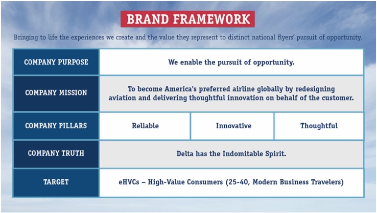
We began our process by reviewing the established frameworks that defined Delta’s tone in marketing and advertising and discovered the three pillars of reliability, thoughtfulness and innovation:
These adjectives are certainly helpful in the creation of outbound, unidirectional advertising, but Delta.com has unique challenges. No longer passive consumers, customers on Delta.com are actively looking for information motivated either by emotions and/or rationale. The typical customer journey through the site often includes four phases:
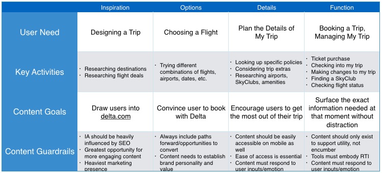
What this chart made clear was that we needed more than a marketing tone to develop a content strategy for Delta.com. We needed a service tone.
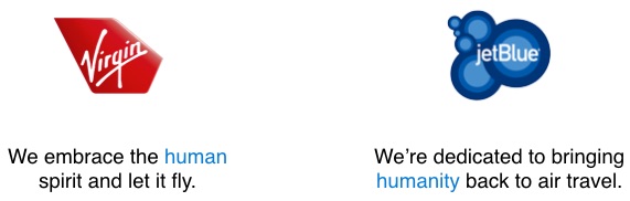
Our pursuit of a service tone began with an audit of competition. We discovered most companies had not established a service tone, and of those who had only two stood out: Virgin and JetBlue. Both were presenting themselves as “human” airlines with Virgin securing a more suave tonal range and JetBlue a more deferential position:
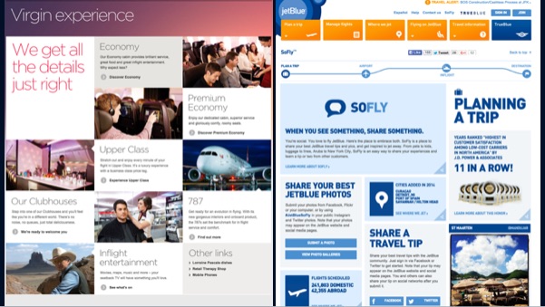
Neither suave nor deferential described the service experience on Delta, but through stakeholder interviews and customer research we uncovered a key insight: both employees and customers agree that Delta is a gracious airline.
Gracious. It’s a pointed word. Perhaps because of it’s southern/Georgian heritage, and perhaps because of their hiring and training practices, Delta has established itself as the courteous, kind and pleasant airline even in the worst of conditions. This is apparent in terminals and on flights, and we proposed it as the guiding principle for all content on Delta.com.
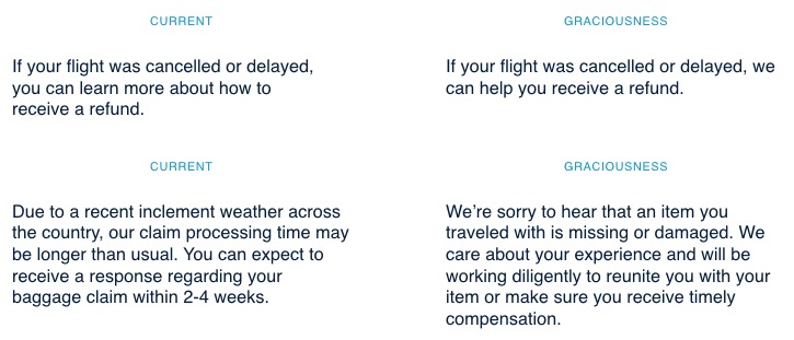
Selling in this idea to the clients did not require much effort. Graciousness immediately resonated without the need for further justification. It was as if we had simply pointed out the very thing that had been there all along (which is pretty much what we did…the sign of a good strategy). Further copy exploration proved that a gracious tone, when applied to current content, could result in a much more approachable website that addresses user needs and helps to navigate our site:
The shift is subtle but significant. It is being applied across all site visuals and verbiage, and initial results from ForeSee and Omniture data indicate increased customer satisfaction and improved site performance. As the Delta.com gets rebuilt as a global, multilingual, mobile first and responsive web experience, the company plans to apply this content strategy to all fundamental components of the site. The result will be a truly gracious site experience from initial search to order completion.
