Bringing a New Brand Position to Life
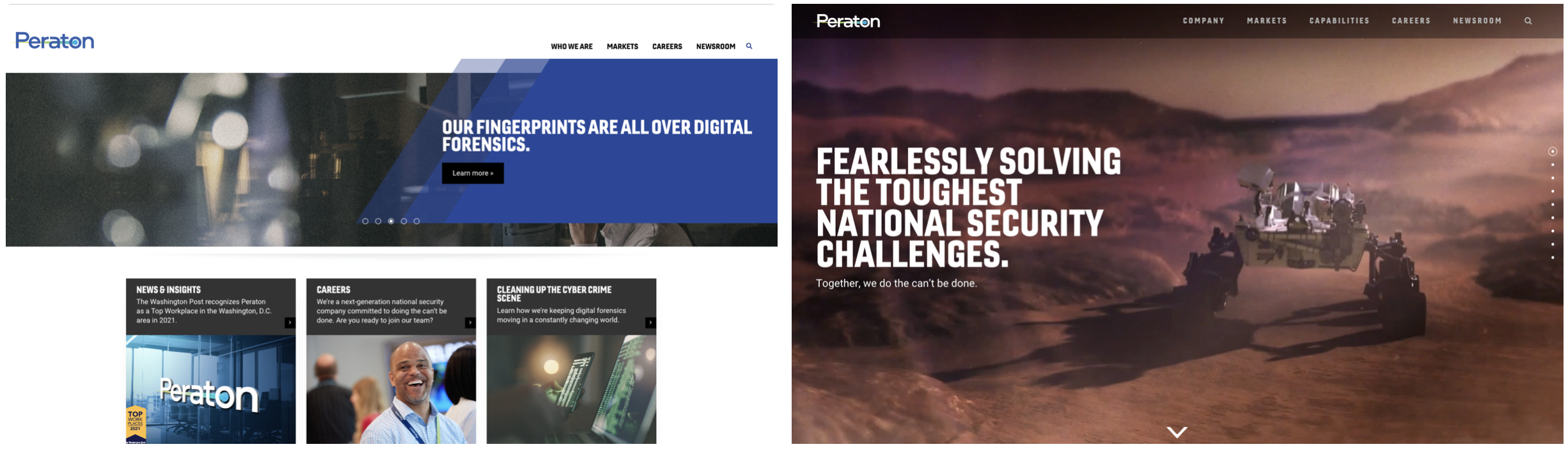
As Peraton continues to rapidly grow through new business and M&A, more prospective clients and employees were coming to Peraton.com to learn more about the company. What they found was a site that was functionally sound and informative but not a reflection of the new Peraton brand guidelines that had been established in recent months.
Our challenge was to redesign Peraton.com to align with these new brand standards. Our goal was to showcase how Peraton partners with their clients to solve seemingly impossible problems.
Our Target
Prospective clients across multiple government agencies come to Peraton.com to learn more about its services prior to submitting an RFP.
As they surf sites of potential vendors, prospective clients are likely in the process of documenting the requirements of the job they are budgeted to execute. They recognize that websites will only give them so much information, and much of the interaction they need will come through 1:1 conversations that will follow. To this end, when on the site they are looking for an overview of why they should consider Peraton, what the company does, and how they have done it for others in the past (i.e., case studies that make these service offerings tangible).
What We Want Them to Believe
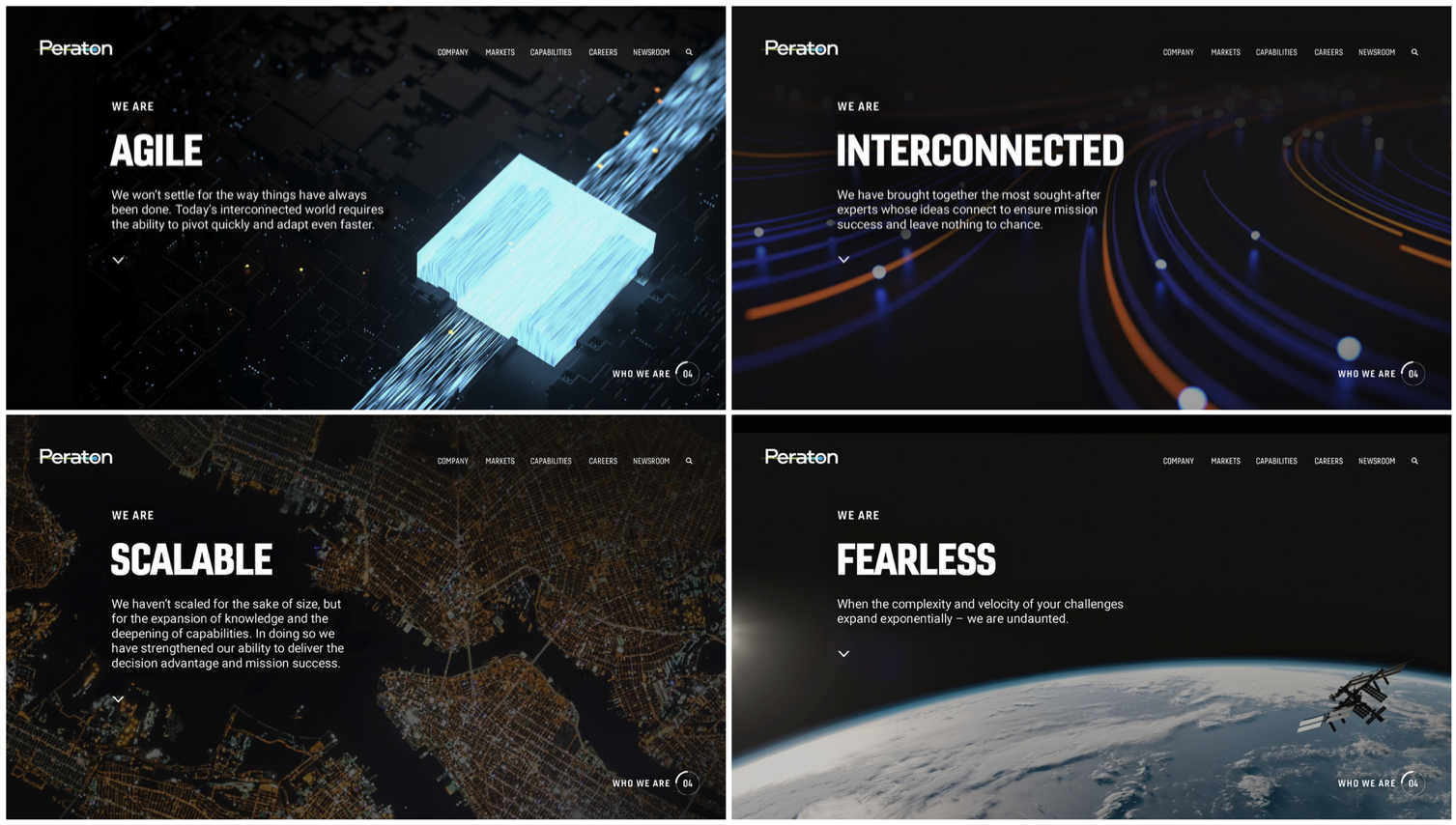
We want them to see Peraton as a seemingly invisible but powerful force behind missions of consequence.
Through how we speak to and visualize our services online, we want our audience to see Peraton is being at the forefront of delivering the next big thing every day. We want our brand language to convey the fact we think differently. We are not mired in the past but rather look at problems with fresh eyes. We look past the obvious to completely transform how things get done, no matter what the challenge.
Our Single-Minded Idea
Do The Can’t Be Done
Site Before/After
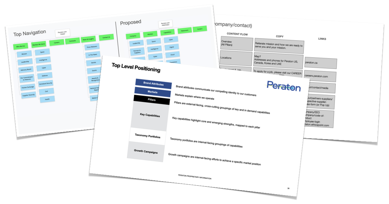
Content Strategy
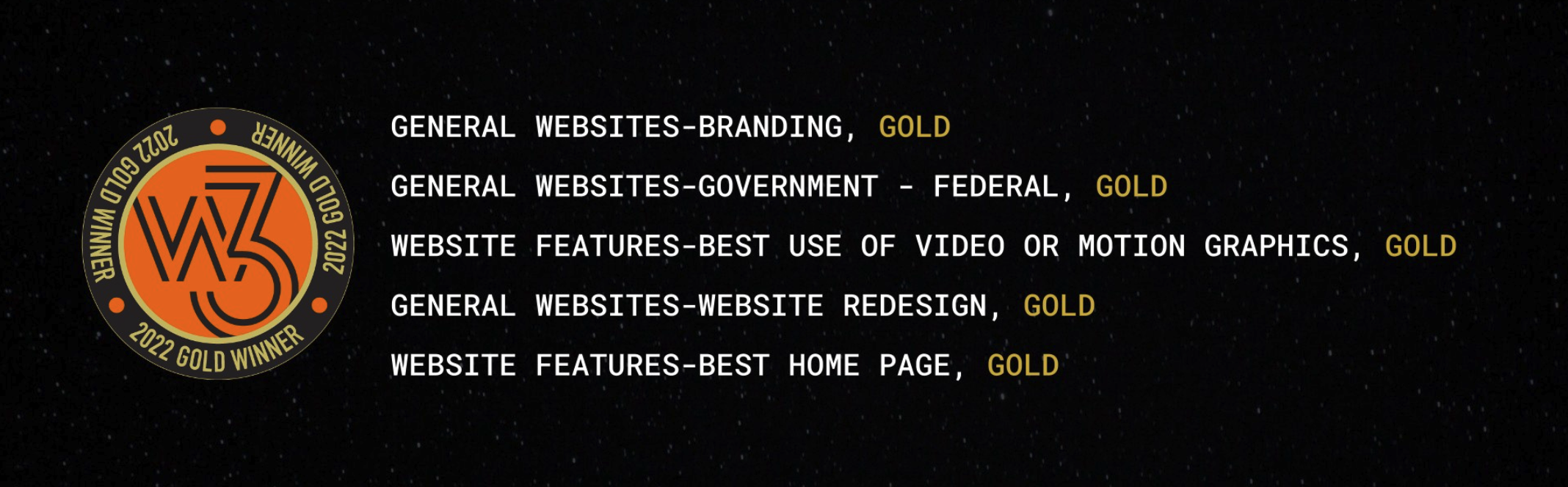
Results